Effective Small Caps in Scrivener 3


Small caps are commonly seen in both printed and electronic books to represent signs or other messages that italics or quotes don’t quite cover, so there must be an easy, supported way to set them up in Scrivener so they export properly to PDF, ePub, and mobi formats. Right?
Clearly not, or I wouldn’t be writing this article.
For those who want to skip the discovery process and go straight to the solution, see the “TL;DR” section at the bottom of this post.
Wait! What about Scrivener’s “Make Small Caps” feature?
That’s right! Scrivener has a built-in small caps solution, doesn’t it? Highlighting text then clicking “Edit -> Transformations -> Make Small Caps” from the top menu does exactly what it says. Capital letters remain full size, but lowercase letters look uppercase, just smaller.
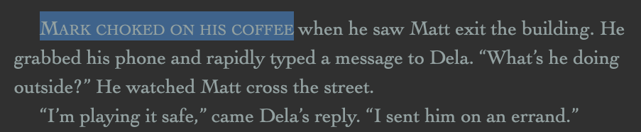
This is, in fact, exactly how Scrivener does it. Purists turn in their typograph-perfect graves at the thought. It doesn’t look as professional as the small caps variant available in some fonts, such as Baskerville, but for most mortals it works fine. Done!
Or… not. To modify a small caps block, we have to first convert it back to normal via the edit menu, make the changes, then convert it to small caps again. It’s not the end of the world, but there must be an easier way.
Compile-wise, if your project has every page set to render as-is, then the output may look fine in all formats, but you’re also not taking advantage of Scrivener’s powerful compile transformation options, such as changing fonts, font sizes, highlights, spacing, and others. If you’re like me, you’re regularly exporting to 2-4 different formats and, unfortunately, each needs its own, unique TLC to look nice.
And we want it to look nice, don’t we?
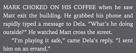
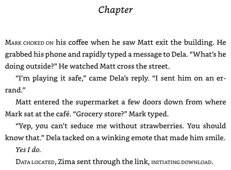
For example, if we compile the document above, MS Word and PDF look like you’d expect, but open an ePub or mobi file on your favorite eReader, and what was supposed to be small caps may be ALL CAPS, AS IF YOU’RE ANGRY OR YELLING. Or, if you used the Default export settings, the font sizes may be inconsistent, too small, or too big. What happened?
Well, Scrivener’s default Kindle export transforms section text to a uniform font size, so those reduced-font-size faux lowercase small caps are now the same size as the rest of the text, except they’re actual capital letters. Yes, we can tweak the settings and have it not do that, but then we can’t alter the font size during our compile to make it different per format. 14-point font looks great on a Kindle but may be too large for a print-ready PDF.
Fooey.
Fine, I’ll use Baskerville instead
Great! Except… most eReaders support a limited subset of fonts, and Baskerville isn’t one of them. To prove it, let’s undo our small caps above, change the font to Baskerville, select the “small caps” variant, and compile again.
Whoa-ho, score! Maybe the purists were right. The PDF looks even better this time! But the mobi, not so much. The supposedly small-caps’d text looks like all the other text. The eReader didn’t recognize the font, so it changed it to the closest family, or if it couldn’t find a family, used the default font, neither of which support small caps. Darn you, Amazon! Curses, Apple and Kobo!
Oh well. Until they align on a universally supported font with a small-caps variant, we’ll have to figure out something else.
Did someone say “styles”?
Aha! Styles, the heralded savior, new in Scrivener 3, and prophesied to make our lives better by feeding us cake in bed—or the writer’s equivalent, anyway.
Styles are to manuscripts as re-usable code is to software development. They allow writers to adhere to the DRY principle—Don’t Repeat Yourself. DRY allows developers to change a piece of common functionality one time and see its effect everywhere it’s used, instead of making that change manually all over the place.
In writing, let’s say we’re using bold font style to represent text on a sign, and we wanted to change it to something like, oh, I don’t know… small caps! If we’re lucky, our word processor will allow us to search for text based on font style, and if we’re luckier still, it will select all found instances at once and allow us to change the font and style to small caps. If not, we have a lot of Find Nexts and font changes in our future, or worse, we’ll have to scroll through our entire manuscript and hope we catch everything. Not the way I like spending my Saturday.
Fortunately, styles can help reclaim our precious weekends. Styles in Scrivener have been covered in great detail elsewhere, so I’ll only say that if we had created a style called “Message”, made it bold, and applied that style to all places in our manuscript where sign text appears, changing from bold to small caps everywhere with confidence is achievable with a few well-placed clicks. Even better, Scrivener allows us to change style details during compile, so we can make our Sign use small caps for PDF output, which can embed fonts like Baskerville, but use italics for eReaders.
So let’s try it! In scrivener, select a section of text, change the font to Baskerville, check the “small caps” font option, and create a character style from the selection with the amazingly original title of “Message”. Now we can select other sections of text, apply the “Message” style, and poof!
Now we’re cooking. We’ve marked the text we want to small capsify and applied a style we can override during compile in any way we want. Muahaha, the power… (ahem)
All right, let’s do this. PDF we’ll leave with our Baskerville font, but mobi and ePub we want to use Scrivener’s small caps feature. So we hit compile, edit the Kindle format, go to Styles, add the “Message” style we created, and…
Huh. There’s no small caps option. We can edit all aspects of the font, even remove styling completely, but small caps is conspicuously absent. Drat, another dead end.
Or is it?
CSS to the rescue!
Before you panic, no, I’m not going to force you to learn CSS like your mother forced Brussels sprouts on you as a kid. The developers at Literature and Latte have taken that pain on for us, and while I do intend to keep my promise about not teaching you CSS, a little peeling back of the ePub and mobi covers is in order.
The two popular eBook formats have many similarities under the hood, but the biggest by far is that they’re really just well-organized HTML files with some XML metadata to tell the eReader how to put it all together.
That’s right, your fancy-dancy eReader is really just a specialized web browser.
But in this case, it’s a good thing. For outputs that support CSS, such as HTML, ePub, and mobi, Scrivener provides an extra left-nav format option called (you guessed it) “CSS”. Clicking that bad boy shows us a bunch of stuff that doesn’t make sense to anyone except web developers—and sometimes not even them. No worries, though, because we’re going to make this easy. In the “Custom Stylesheet” dialog, just below the first comment (“/* Begin custom stylesheet */”), copy and paste the following:
/* Override class to use small caps */
.message { font-variant: small-caps; background-color: inherit; font-weight: inherit; font-style: inherit; text-decoration: inherit; }
What does it do? Mostly it undoes what we’re about to do in the next section, but I bet you can spot the important bit. “font-variant: small-caps” is a CSS transformation that converts lowercase letters to upper and decreases their font size to create the appearance of small caps, and since our eReaders are more-or-less full-featured web browsers, they support it.
I… just broke my promise, didn’t I? Well, hopefully you didn’t learn too much CSS. On to workaround #2…
Almost there
All complex software has bugs, including Scrivener 3 and the dozens or hundreds of libraries it uses to bring us all those cool features. One bug, unfortunately, causes font-only styles in the resulting HTML to sometimes misbehave, or apply the style to a “p” tag instead of a “span”. It may not even be a bug, rather a feature that’s angry I’m using it in a way it didn’t intend. I had trouble reproducing it in documents other than my primary manuscript, but whatever the cause, the following workaround changed the output to what I expected and made everything look great.
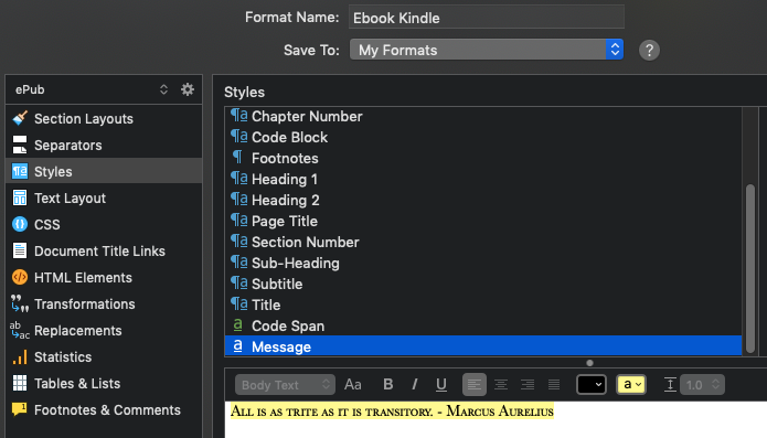
Go back to our “Compile -> Format Settings -> Styles” page in Scrivener and select our “Message” style. The preview box shows Baskerville in all its small caps glory. Click the yellow highlight box to add a highlight to our text. Left to its own devices, yes, this would cause all sign styles in our compiled manuscript to look like yellow highlights on an eReader, but notice the “background-color: inherit” from our CSS above? This overrides the highlight and forces it to look like everything else. For instance, if the message style actually was part of a larger highlighted text block, it would look as expected, otherwise the highlight will be removed.
In your manuscript, you’re welcome to compile without this workaround, and it may work, but you’ll need to keep a constant eye out as your manuscript grows for select instances of your style that don’t compile correctly.
Tada
Okay, last time! Hit the compile button and open the PDF and ePub files. PDF, check! Baskerville goodness, as expected. ePub, check! It doesn’t look as good as the PDF, but it’s as close as we’re going to get on an eReader.
Success! We may be able to specify a minimum line height in our CSS to account for those pesky scenarios where lowercase runs the entire line, which moves the line up a few pixels and looks strange on an eReader page, but I haven’t researched that yet. Look for a follow-up later.
TL;DR
Scrivener’s “Make Small Caps” feature works in some scenarios but not all and can be a hassle to during regular edits. To make it work consistently for both print-ready PDFs and mobile formats, such as ePub and mobi, with minimal formatting headaches in the editor, we must use a combination of a font that supports small caps, styles, CSS, and style transformation during compile.
- Open Scrivener and load your manuscript
- Select a passage of text you would like to be small caps
- Change the font to Baskerville (or your choice) with a small caps option
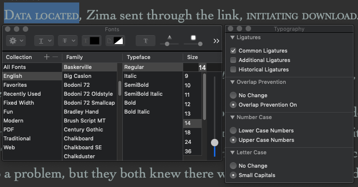
- From the top menu, select Format -> Fonts -> Show Fonts
- In the Fonts dialogue, starting from the left, select:
- Collection: English
- Font: Baskerville
- Typeface: Regular
- Click the gear in the upper left and select Typography…
- In the Typography dialogue, select Letter Case -> Small Capitals
- Close both dialogues
- Create a style for small caps text
- From the top menu, select Format -> Styles -> New Style From Selection…
- Enter a name for the style (I recommend something simple for the CSS step further on, but you can use "Message" as outlined above if you're not picky)
- In Formatting, select “Save character attributes”
- Uncheck “Include font size”
- Click OK to save the style
- Apply the style to appropriate places in your manuscript
- Highlight the target text
- Select the style from the dropdown in the upper-left of the editor window
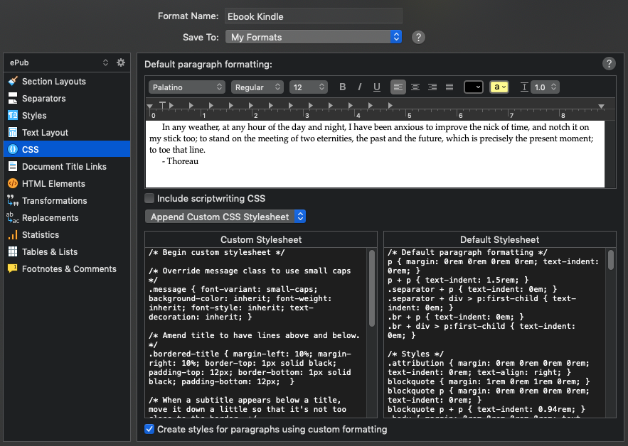
- Edit the compile format
- Click the Compile button at the top of the window
- Select Compile for: “Kindle Ebook (.mobi)” or “ePub Ebook (.epub)”
- If you have your own custom format, click the gear in the lower left and select “Edit format…”. If you haven’t yet created a format for compiling eBooks, you’ll need to do that now, because the default formats can’t be edited:
- Select the Scrivener Formats -> Ebook
- In the lower left, click the “+” sign and select “Duplicate & Edit Format…”
- Format Name: Name your format
- Save To: Determine whether you want the format to be available globally among your projects (“My Formats”) or only for this project
- Update the style with our hack to ensure the HTML compiles properly
- Click “Styles” in the left nav
- In the upper right, click “+” and select the new style to add it
- In the style editor below, click the yellow “a” box next to the line height option. Don’t worry, we won’t actually apply a highlight in the compiled document.
- Uncheck “Include font size”, unless you really want it
- Customize the CSS to discard the style changes above and apply small caps instead
- Click “CSS” in the left nav
- Ensure “Append Custom CSS Stylesheet” is selected in the dropdown
- In the Custom Stylesheet text box, insert the following 2 lines at the top, just below “/* Begin custom stylesheet */”:
/* Override class to use small caps */
.my-style { font-variant: small-caps; background-color: inherit; font-weight: inherit; font-style: inherit; text-decoration: inherit; }
- Be sure to replace “my-style” with whatever you’ve named your style! Note that if you’re unsure, you can explicitly name your style in the previous style override step, in the “CSS class name” field.
- Click “Test…” to compile a test document. Examine the output to ensure it looks like you expect.
- Click “Save” to commit our format changes
And voila! It’s a few steps to go through, but the good news is that you only need to do this once, especially if you save the format to your computer so you can re-use it among projects. We can now simply highlight any text we want to make small caps, apply our new style, and have confidence it’ll compile correctly.